 This past weekend, I framed and dropped off several of my recent serigraph prints at Katzman Contemporary Projects for their upcoming print show. There will be an opening reception on Friday, May 20 from 6-9pm.
42 Dover Point Road, Suite B Dover, NH 03820 Gallery Hours: Mon.-Thur. 9am-4pm & Sat. 1-4pm
0 Comments
 "Veracity and urgency are embedded in the materials they chose to handle, the images they chose to create, the subjects they chose to depict, and the structures they chose to build. What are the boundaries of identity? Are there new ways to depict the human body? How does one expand conventions and traditions? What does it mean to be radical? How does one structure freedom? How does one make the invisible visible? These students consider these, and other questions, through the disciplines of painting and sculpture, and the friction-filled histories and porous parameters of each."
MFA 2022 Painting and Sculpture Thesis Exhibition (3D Virtual Tour) 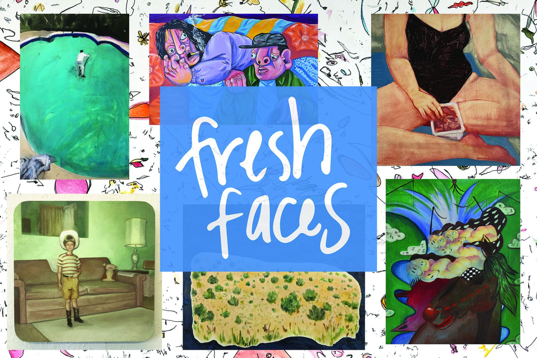 Fresh Faces @ Abigail Ogilvy Gallery
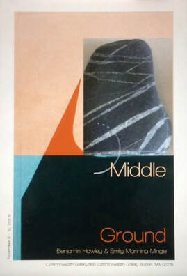
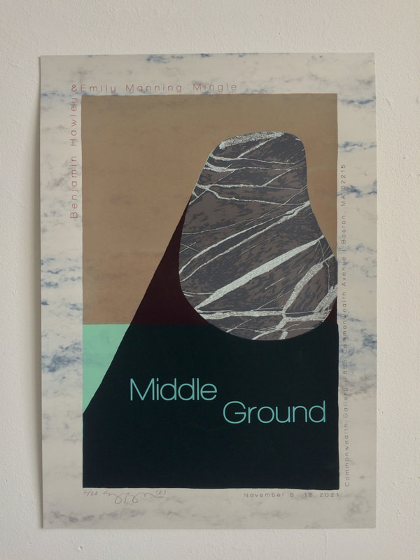
January 19-February 27, 2022 Opening Reception: Friday, February 4 from 6-8 pm Abigail Ogilvy Gallery is proud to present our fourth annual Fresh Faces, an exhibition that introduces new artwork by the Northeast’s most talented student artists, located in Massachusetts, Rhode Island, Connecticut, Maine, New Hampshire, Vermont & New York. The exhibition features 27 artists working in a variety of styles and media. 460 Harrison Avenue, C#7 Boston, MA 02118 Gallery Hours: Wed.-Sat. 11am-6pm & Sun. 11am-4pm 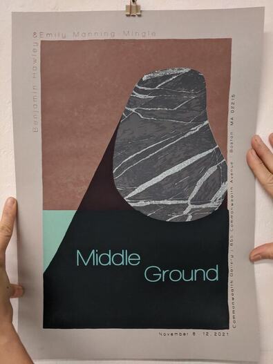 For our second silkscreen assignment, we were challenged to create a poster. A poster? I had no idea what to make a poster about. I talked to my professor and he suggested I make a poster for my upcoming two-person show, Middle Ground, with my friend Benjamin Hawley.
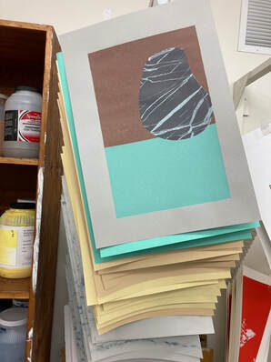
The poster is a limited-edition 15-layer screen print that combines imagery from both of our bodies of work. The image on the left is a rough sketch of the initial design for the poster. Using a photograph of one of Benjamin's prints, I collaged a photo of one of the rocks from my collection on top of his bold shadow shape. After testing out multiple designs for the text of the poster, I felt ready to print. I started with a solid rectangle of sea foam green ink, then taped the screen and printed a transparent layer of peach over the top half. Next, I began printing the layers of the rock by using screen filler to block out sections of the rock and print them with increasingly dark grays. The image on the right shows what the print looks like after about ten layers of ink! 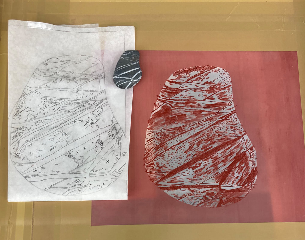 The image above shows how I planned the final layer of the rock portion of the poster. I blocked out everything but the darkest values, then printed the exposed areas over the previous layers. I used a piece of tracing paper to help me understand which layers to block out with screen filler and which layers to leave empty.
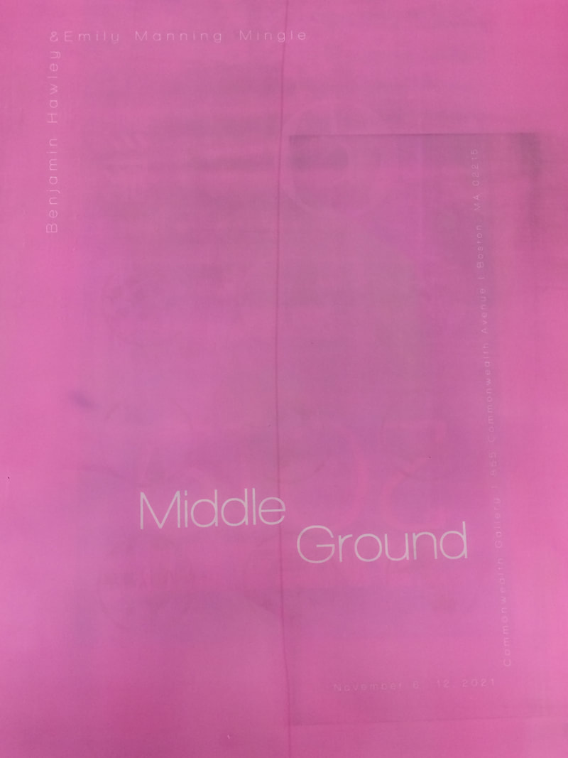
After printing all the imagery, I created a screen of the text for the poster. First, I coated the screen with bright pink emulsion and let it try. Then, I printed the text for the poster onto two pieces of mylar, and taped the mylar prints on top of each other so that they would be opaque enough to block out light. Next, I burned the text onto my screen. To print it, I taped off one section at a time and printed each part of the text in a different color.
I'm so proud of this print and the collaboration and hard work that has gone into my two-person show with Benjamin!
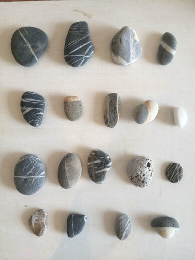
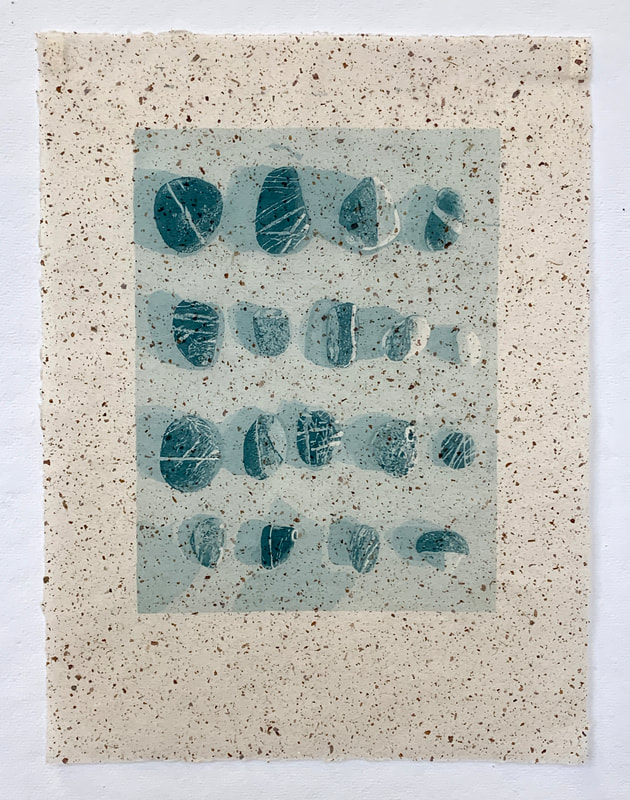
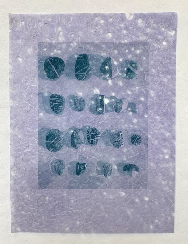
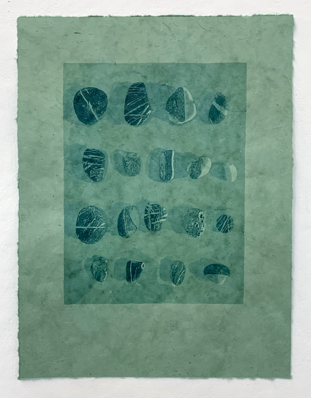
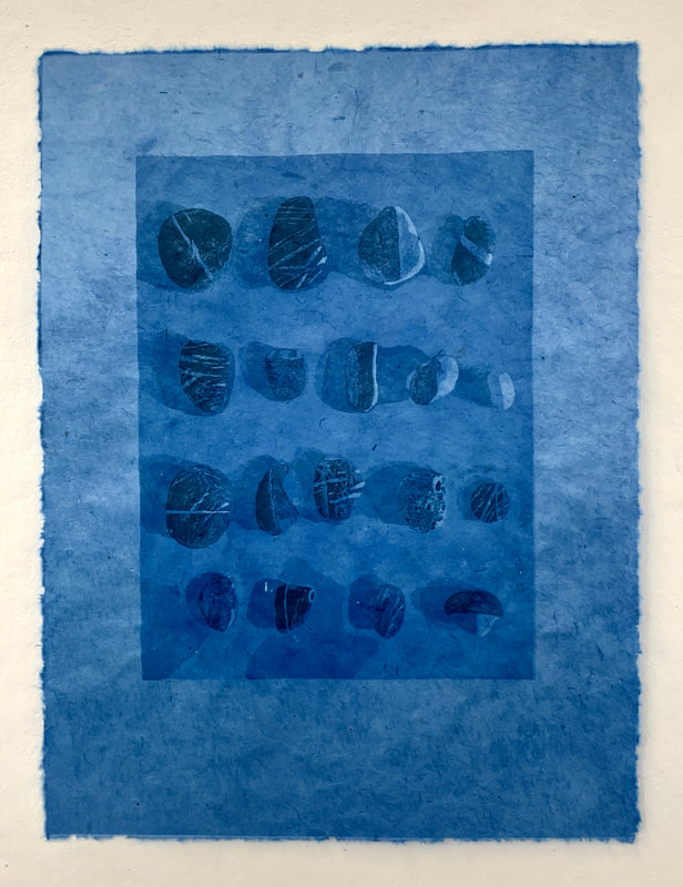
This semester I"m taking a silkscreen class. Our first assignment was to create a reductive silkscreen using layers of one color of transparent ink. My first idea was to translate a plein air ink drawing I had done, but after learning more about the reductive technique, I realized that the drawing wouldn't work well because instead of adding dark marks on top of each other, I had to build value by blocking out lighter and lighter areas. I looked around my studio and noticed a collection of rocks that I had placed on a gessoed panel with the intention of painting them. Because they were all shades of white and gray, I thought it would work well for the project and took a photograph of the rocks. 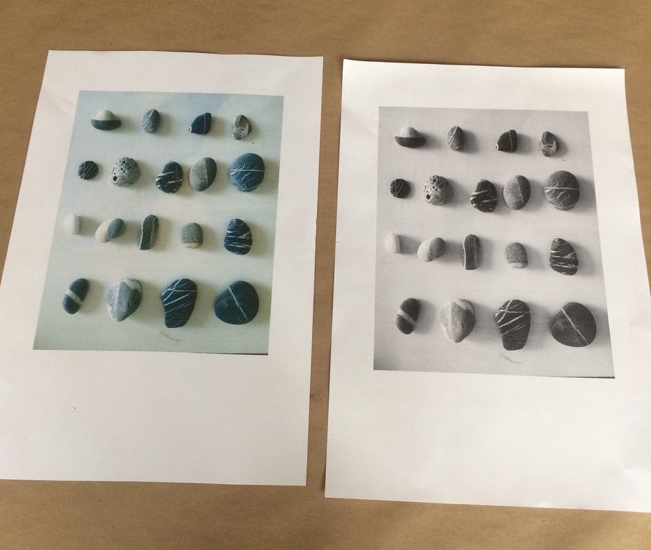 I printed the photograph in color and black and white. I was surprised when the color photograph appeared so turquoise. Turquoise is one of my favorite colors, so I decided to highlight the color in my print. I mixed two containers of ink--a container of dark turquoise and a container of transparent with just a little bit of the dark turquoise. Then I began to block out sections of my image using screen filler. First, I blocked out only the whitest highlights. After printing my first layer of ink, I blocked out the next lightest value, mixed a slightly darker color of ink, and printed that layer. I continued the same process, printing a total of ten layers of ink.
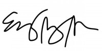
I was interested to see what the ink would look like on different types of paper. I chose a range of colors, transparencies, and textures. Above are a few examples of what the same image looks like printed on different types of paper.
I really enjoyed this technique and can't wait to print more! |