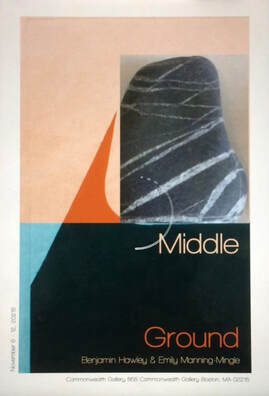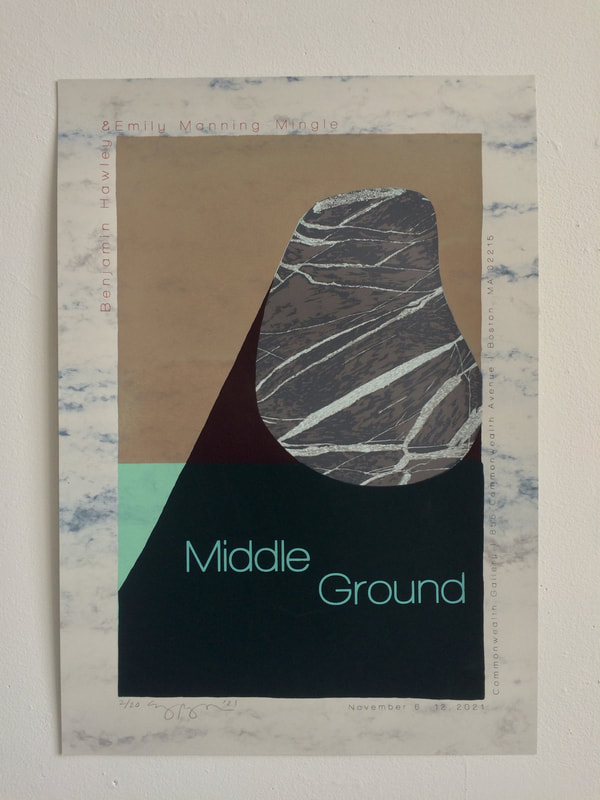
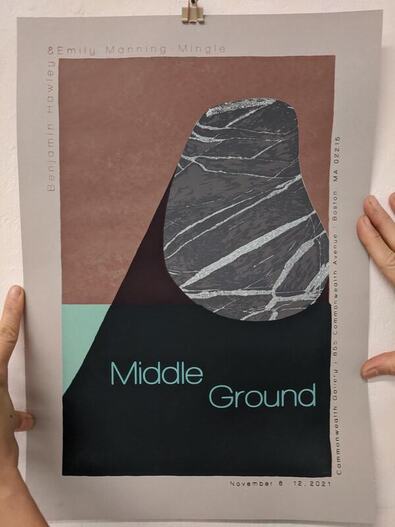
 For our second silkscreen assignment, we were challenged to create a poster. A poster? I had no idea what to make a poster about. I talked to my professor and he suggested I make a poster for my upcoming two-person show, Middle Ground, with my friend Benjamin Hawley.
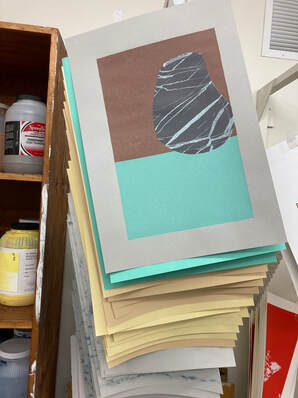
The poster is a limited-edition 15-layer screen print that combines imagery from both of our bodies of work. The image on the left is a rough sketch of the initial design for the poster. Using a photograph of one of Benjamin's prints, I collaged a photo of one of the rocks from my collection on top of his bold shadow shape. After testing out multiple designs for the text of the poster, I felt ready to print. I started with a solid rectangle of sea foam green ink, then taped the screen and printed a transparent layer of peach over the top half. Next, I began printing the layers of the rock by using screen filler to block out sections of the rock and print them with increasingly dark grays. The image on the right shows what the print looks like after about ten layers of ink! 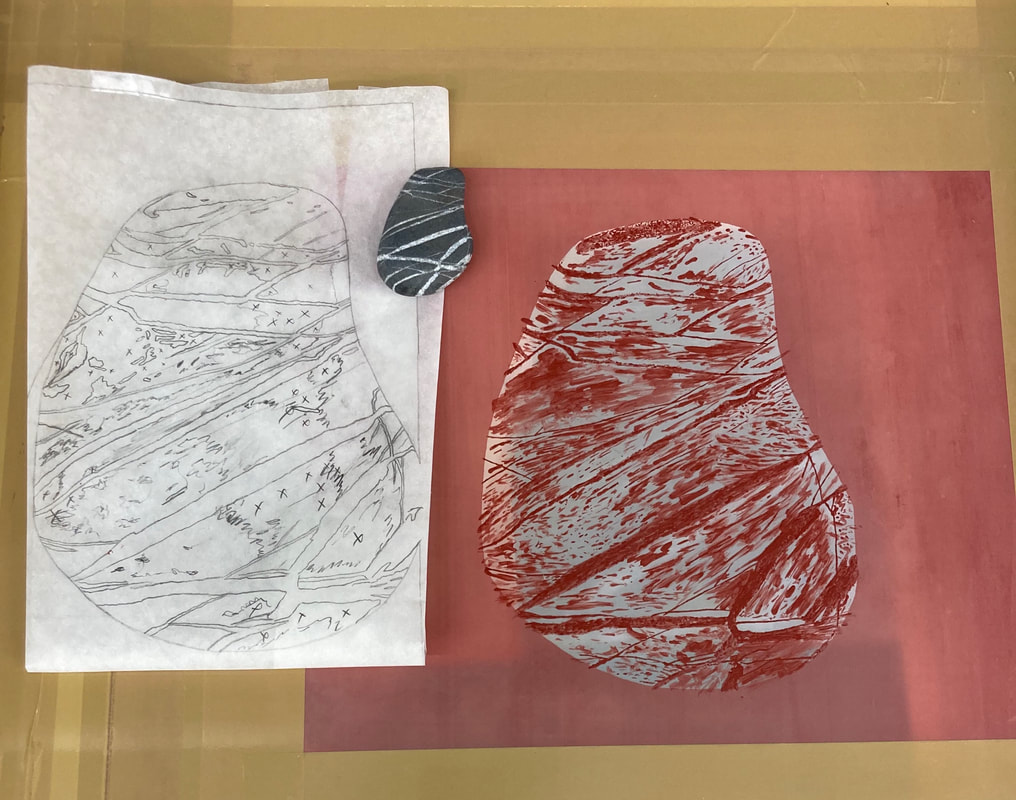 The image above shows how I planned the final layer of the rock portion of the poster. I blocked out everything but the darkest values, then printed the exposed areas over the previous layers. I used a piece of tracing paper to help me understand which layers to block out with screen filler and which layers to leave empty.
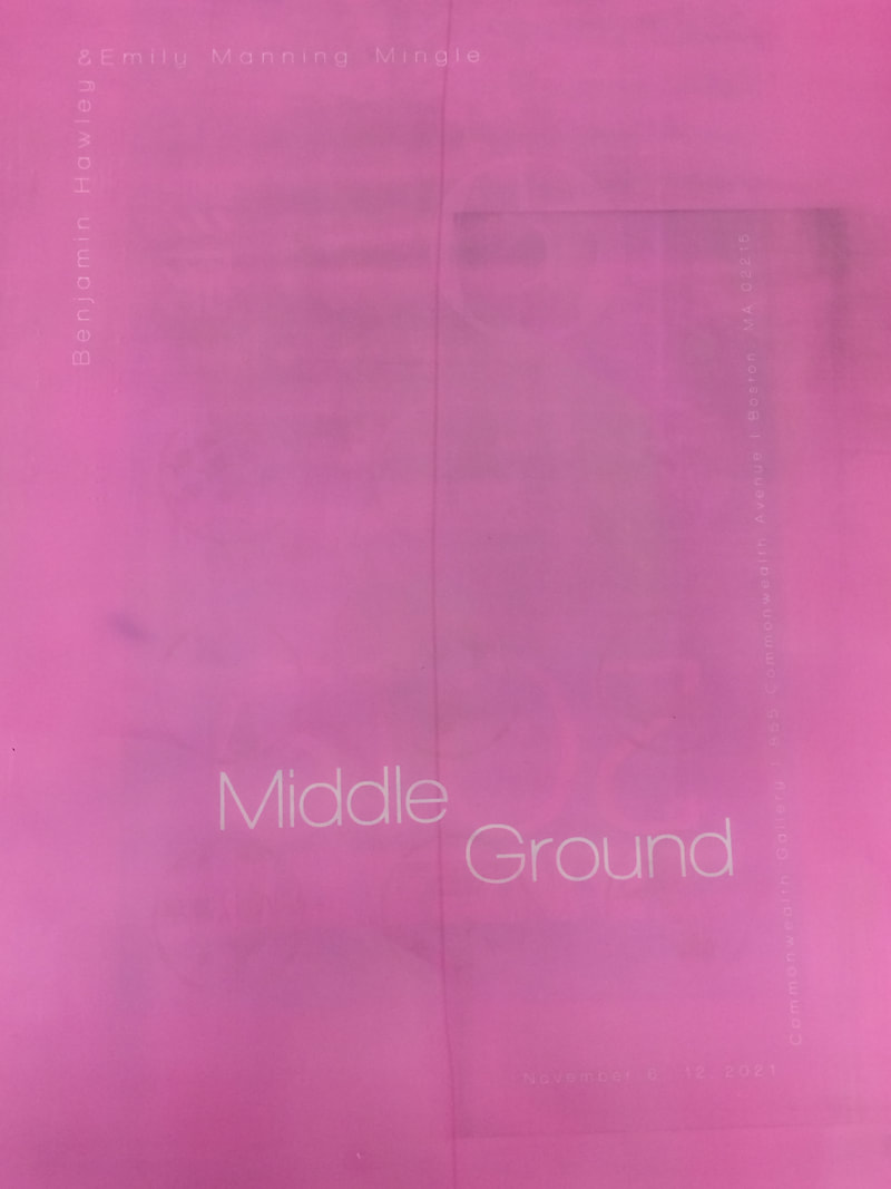
After printing all the imagery, I created a screen of the text for the poster. First, I coated the screen with bright pink emulsion and let it try. Then, I printed the text for the poster onto two pieces of mylar, and taped the mylar prints on top of each other so that they would be opaque enough to block out light. Next, I burned the text onto my screen. To print it, I taped off one section at a time and printed each part of the text in a different color.
I'm so proud of this print and the collaboration and hard work that has gone into my two-person show with Benjamin!
5 Comments
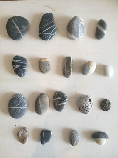
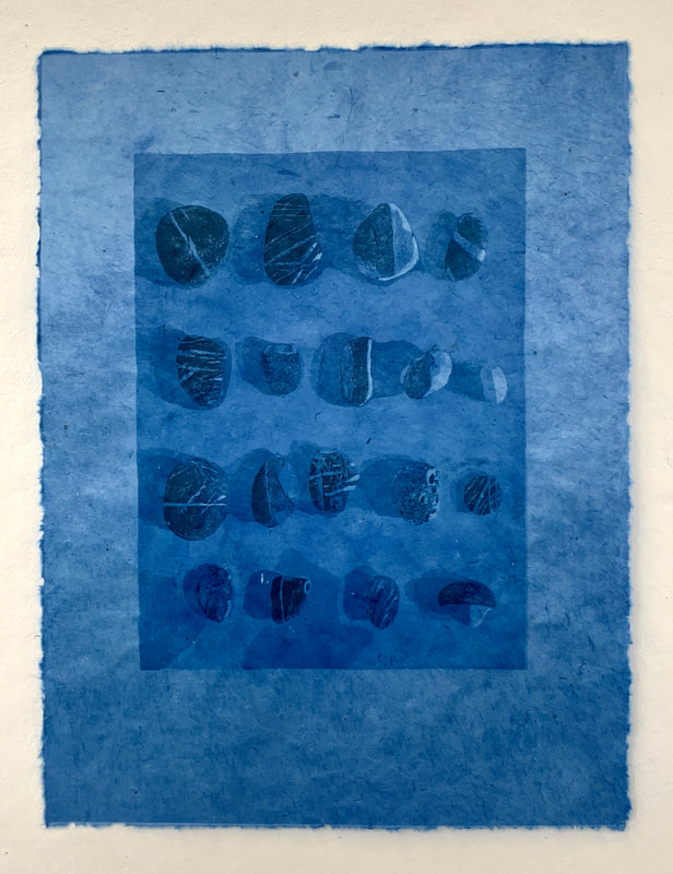
This semester I"m taking a silkscreen class. Our first assignment was to create a reductive silkscreen using layers of one color of transparent ink. My first idea was to translate a plein air ink drawing I had done, but after learning more about the reductive technique, I realized that the drawing wouldn't work well because instead of adding dark marks on top of each other, I had to build value by blocking out lighter and lighter areas. I looked around my studio and noticed a collection of rocks that I had placed on a gessoed panel with the intention of painting them. Because they were all shades of white and gray, I thought it would work well for the project and took a photograph of the rocks. 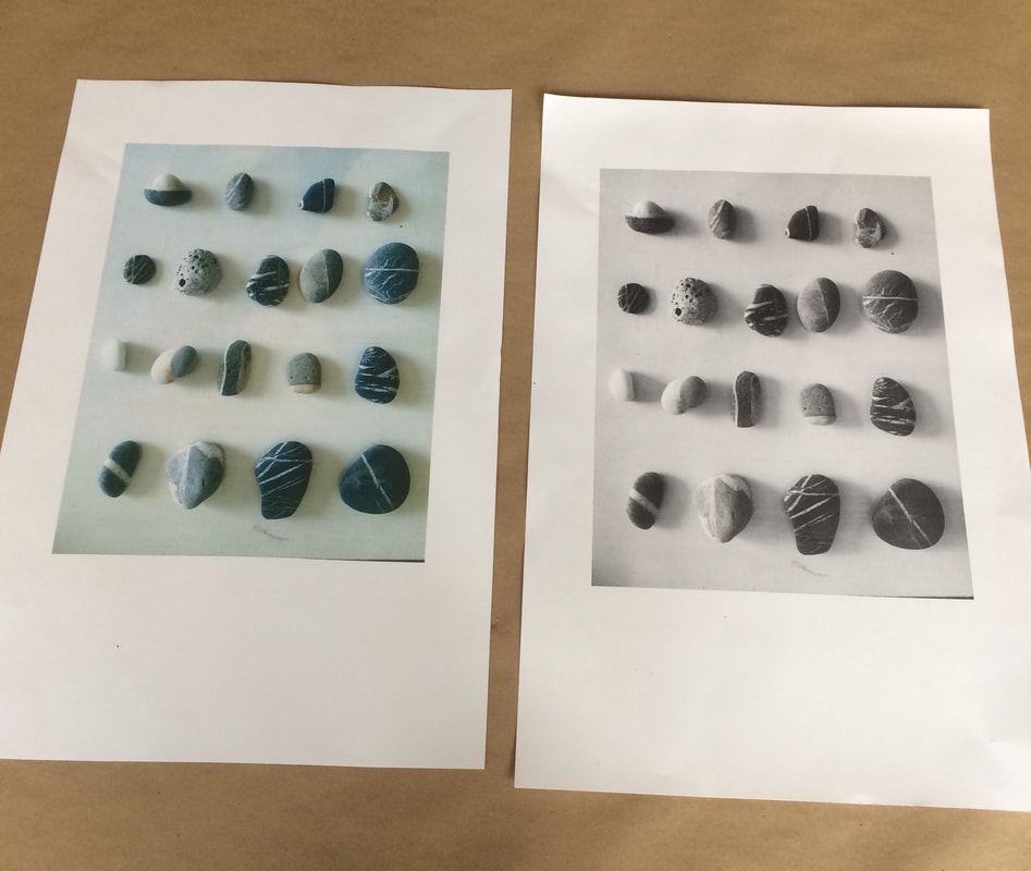 I printed the photograph in color and black and white. I was surprised when the color photograph appeared so turquoise. Turquoise is one of my favorite colors, so I decided to highlight the color in my print. I mixed two containers of ink--a container of dark turquoise and a container of transparent with just a little bit of the dark turquoise. Then I began to block out sections of my image using screen filler. First, I blocked out only the whitest highlights. After printing my first layer of ink, I blocked out the next lightest value, mixed a slightly darker color of ink, and printed that layer. I continued the same process, printing a total of ten layers of ink.
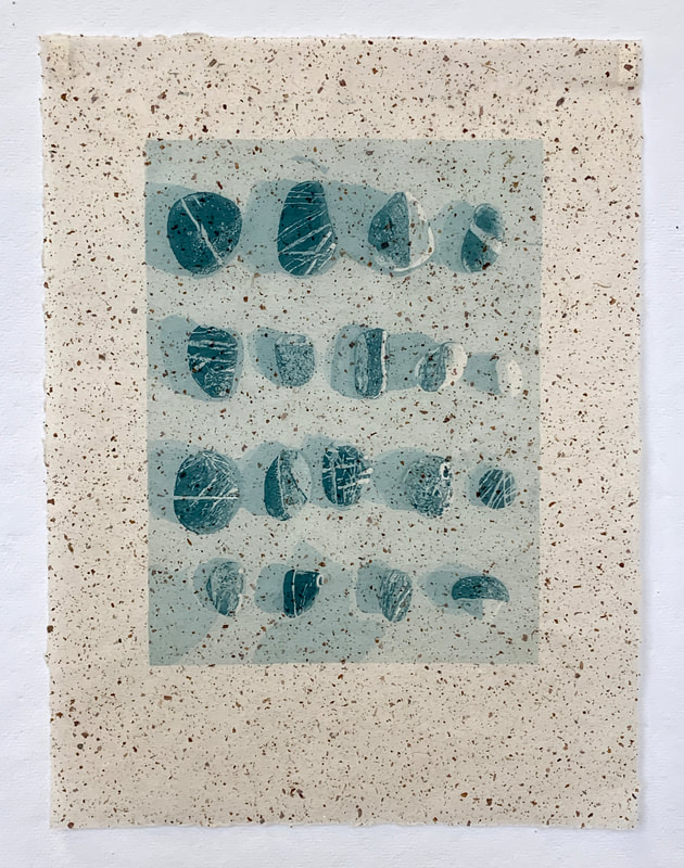
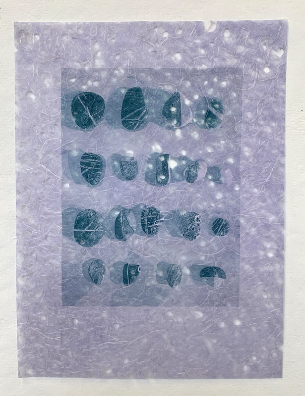
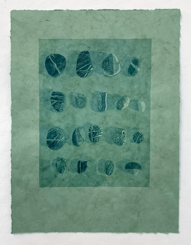
I was interested to see what the ink would look like on different types of paper. I chose a range of colors, transparencies, and textures. Above are a few examples of what the same image looks like printed on different types of paper.
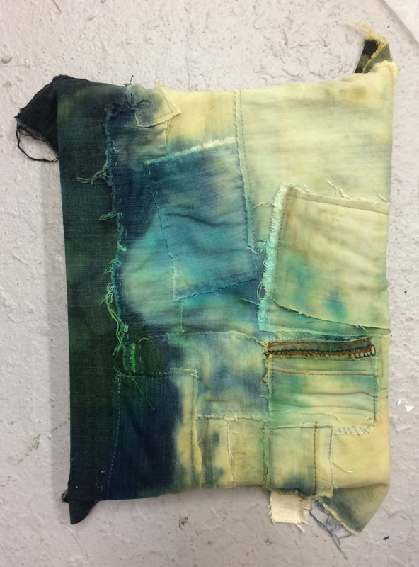
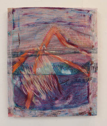
I really enjoyed this technique and can't wait to print more! 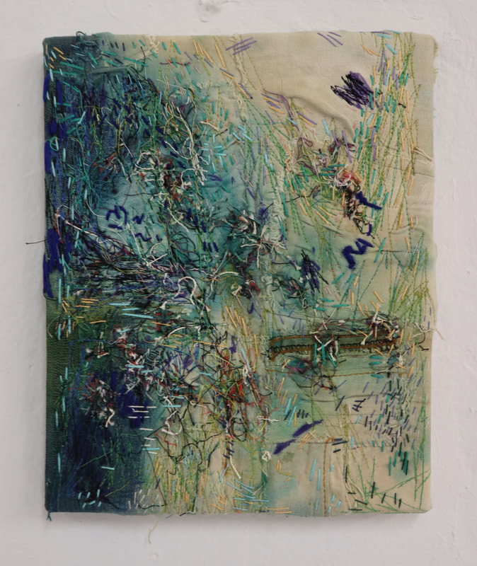 à la ligne, string and thread on denim, stained with fabric dye and bleach, 10 x 8 inches This semester I tried some new ways of working. The piece above was created for an assignment I had early in the semester. Our assignment was to create a painting inspired by a piece of art that we don't like. I first fell in love with painting when I saw impressionist paintings in high school, but have always disliked Renior. His chalky pastel palette is off-putting and his forms often lack definition. They're so etherial, like they're made of someone's hot breath. But the assignment intrigued me. I started looking at his paintings online and came across the painting Le pêcheur à la ligne. I was drawn to the phthelo green + beige color palette and marks he used, so decided to try and reproduce those elements of the piece, minus the subject matter. The first thing I did was turn the reproduction of the painting upside down as a way to isolate the colors and marks. Working from "back to front," I poured fabric dye on a canvas of stitched jeans that I had made earlier. Then I added some bleach to the dye. I worked back and forth until I created a "stain" to work on top of. Then I began adding lime green stitches to the denim using my sewing machine and drawing with a royal blue marker to describe some of the forms I observed, like the flittering leaves of the vegetation. Then, for several hours, I continued layering machine stitches, hand embroidery, and loose threads to the surface until the image felt resolved. I really enjoyed the assignment. It was a practice in empathy. I learned to appreciate the technique of someone's work who I usually have a negative reaction to. It was a little like being locked in a room with an enemy and being forced to find common ground.
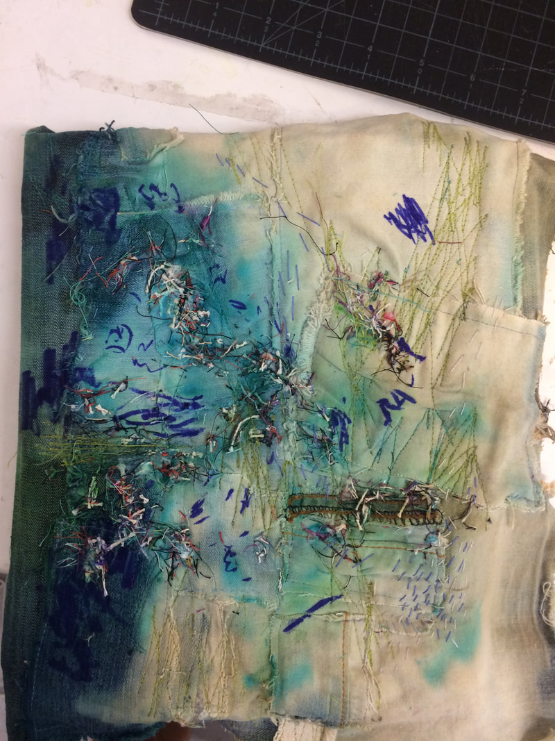
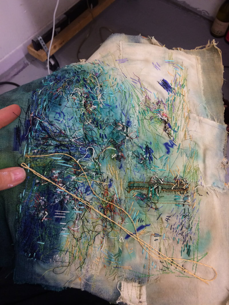
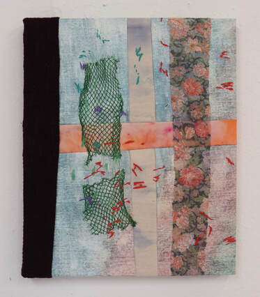
Left: A Piece of Me, A Piece of You, acrylic, spray paint, oil pastels, string and thread on sewn canvas and repurposed clothing, 18 x 22 inches Right: Love Quote, repurposed clothing and mesh on sewn canvas, stained with fabric dye, and oil on pre-primed canvas, 22 x 18 inches I continued experimenting with mark-making throughout the semester. Above are two different examples of experiments in mark-making that I tried. On the left, I layered a lot of different colored sewing machine stitches on top of paint, spray-paint, and oil pastel until the colors began to blend together. This caused the canvas to warp and buckle. I had seen this technique several years ago in a video of Rebecca Ringquist explaining her process and knew that I wanted to try it at some point. On the left, I created individual marks with the machine, dispersing them across the canvas. To me, they start to resemble letters or characters from an alphabet. 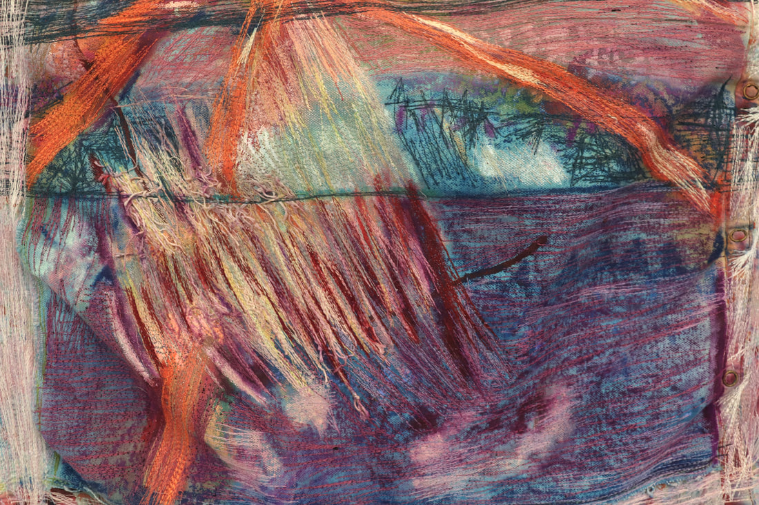 Detail of A Piece of Me, A Piece of You To see more of the work I made this semester, click on the tabs pieced and painted and fabric paintings.
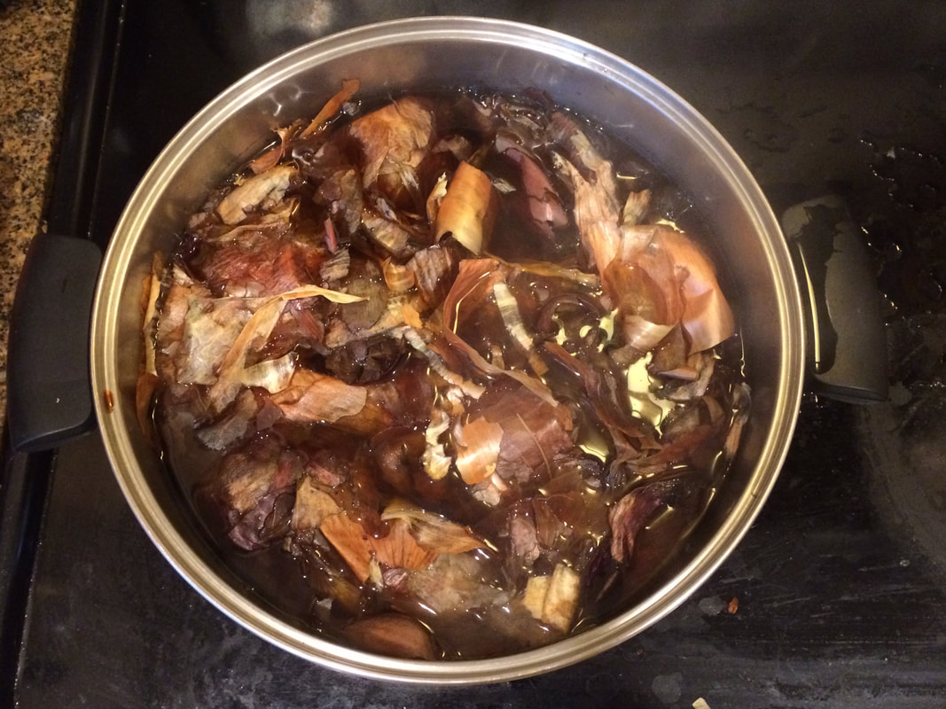
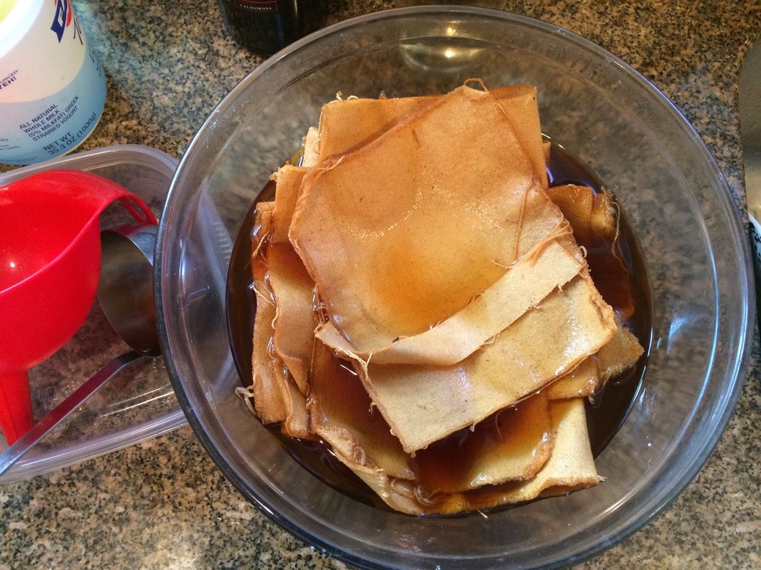
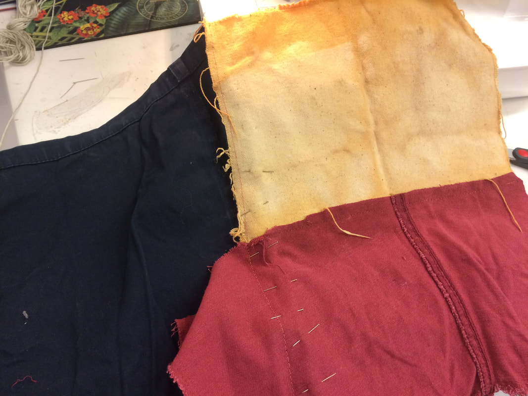
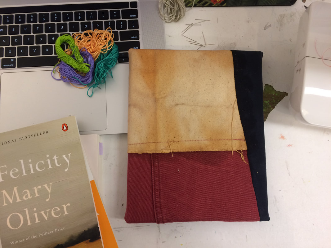
I recently experimented with natural dye. I have been wanting to try this for a while and recently found some time to do it. The process was relatively simple and I LOVE the results! The first step was to collect all of the skins. I collected the skins from at least a dozen onions over a couple of months. I stored them in an empty yogurt container (and later realized I could have kept them in the fridge, rather than on the counter). Once I had enough, I put all of the skins in a large pot of water and set it to boil. (I boiled some of the water in an electric kettle to make this process go a bit faster. Once the water boiled, I turned the heat on low and let the skins sit for a couple of hours. Next I strained the dye into a glass bowl and layered some canvas into the bowl. I put a glass jar of water on top of the canvas to press it down and set the bowl outside (so that the smell didn't stink up our apartment). I left the canvas to soak in the dye for a few ours, then removed it and let it air dry on top of a few plastic bags. After the canvas dried, I brought it to my studio. I decided to use some of the first batch of dyed fabric for one of my drawing assignments: to make a drawing response to a poem. I chose Mary Oliver's Song for Autumn. I love that I can feel her presence when I read her poetry. Like I am right there with her, traipsing through the marsh or walking by the sea. 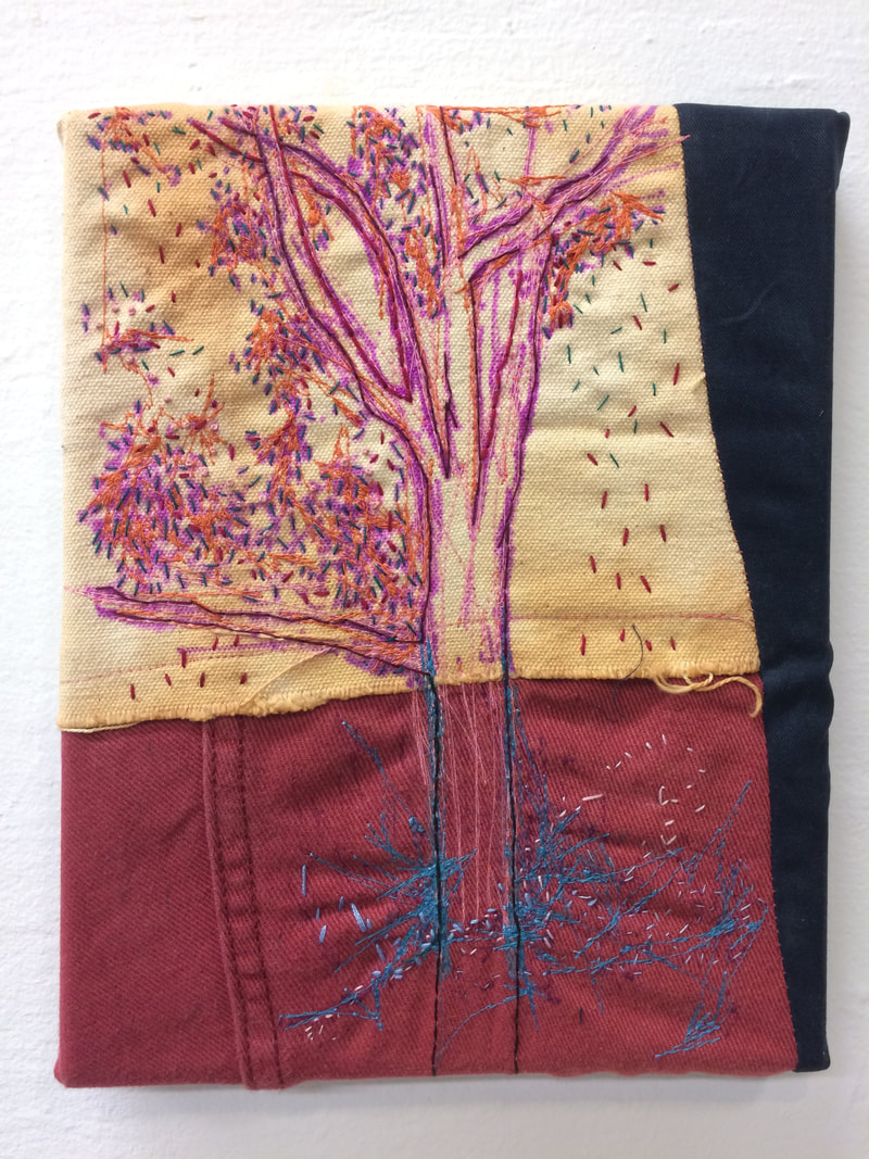 In response to her poem, I created several drawings of trees at night. I wanted the experience of observing to come through and to experiment with my sensory experience of looking.
I transfered one of my drawings onto the canvas and then stitched the lines by hand. I've been having a wonderful time at my residency at Gallery263! Recently, Moriah, one of the interns at the gallery interviewed me about the work I am making at the gallery this summer for their "Meet the Residents" series. Read the interview here and check my instagram for more process pictures! We also have two upcoming events:
Public Critique #2: Tuesday, August 13, 7-9pm Opening Reception: Friday, August 23, 7-9pm |